Page Management
Page Options
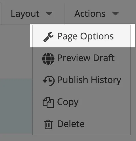
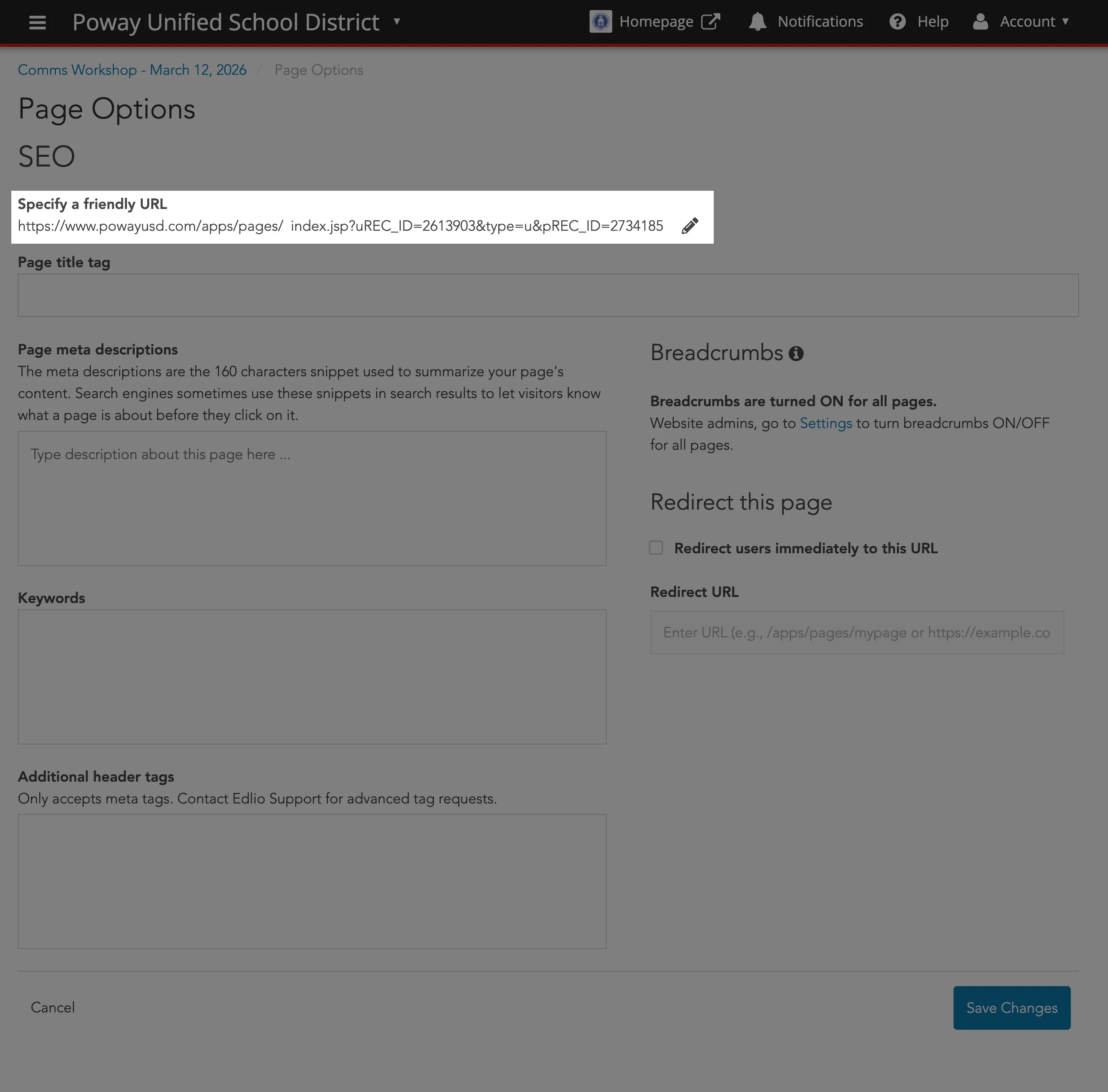
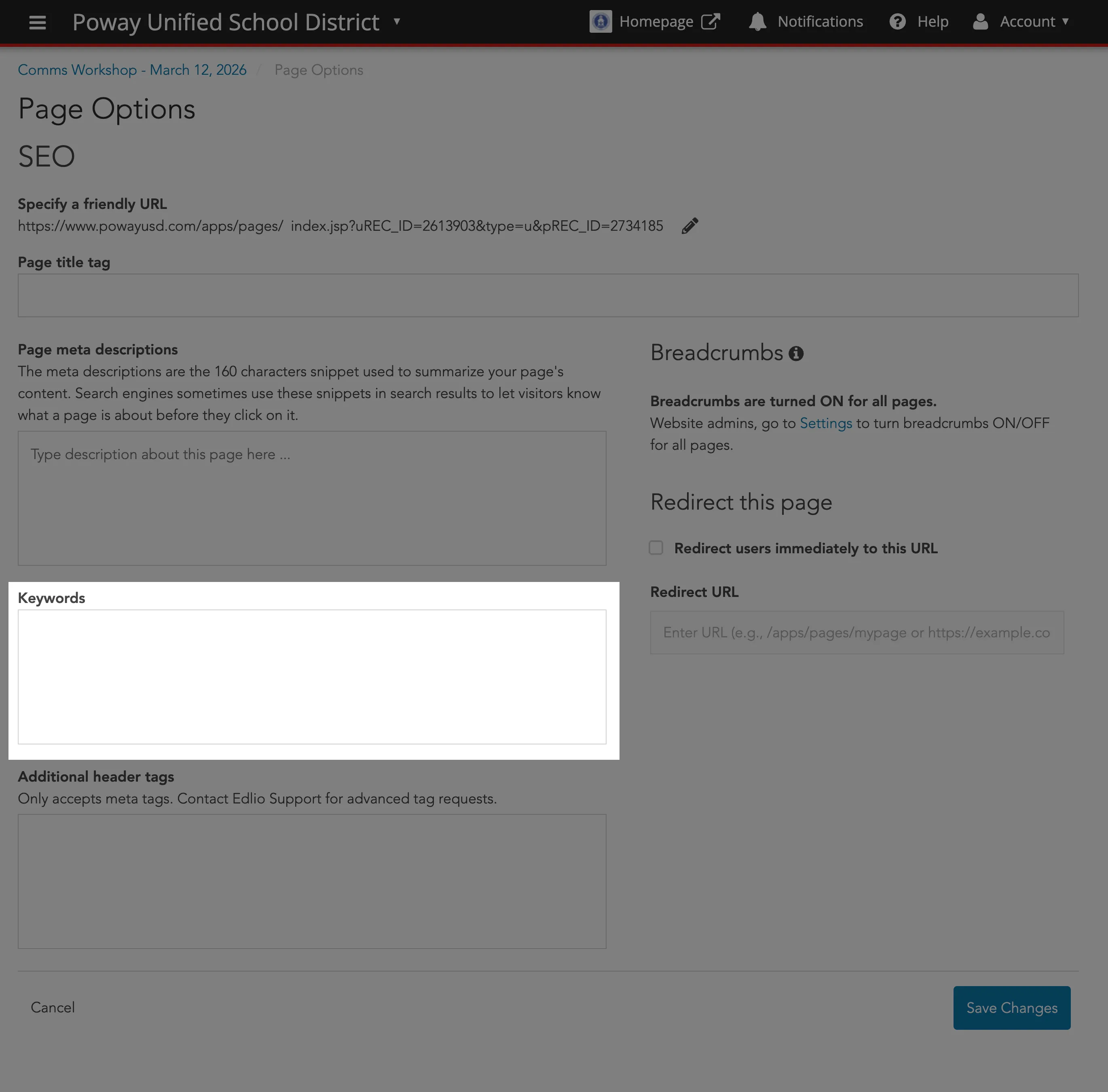
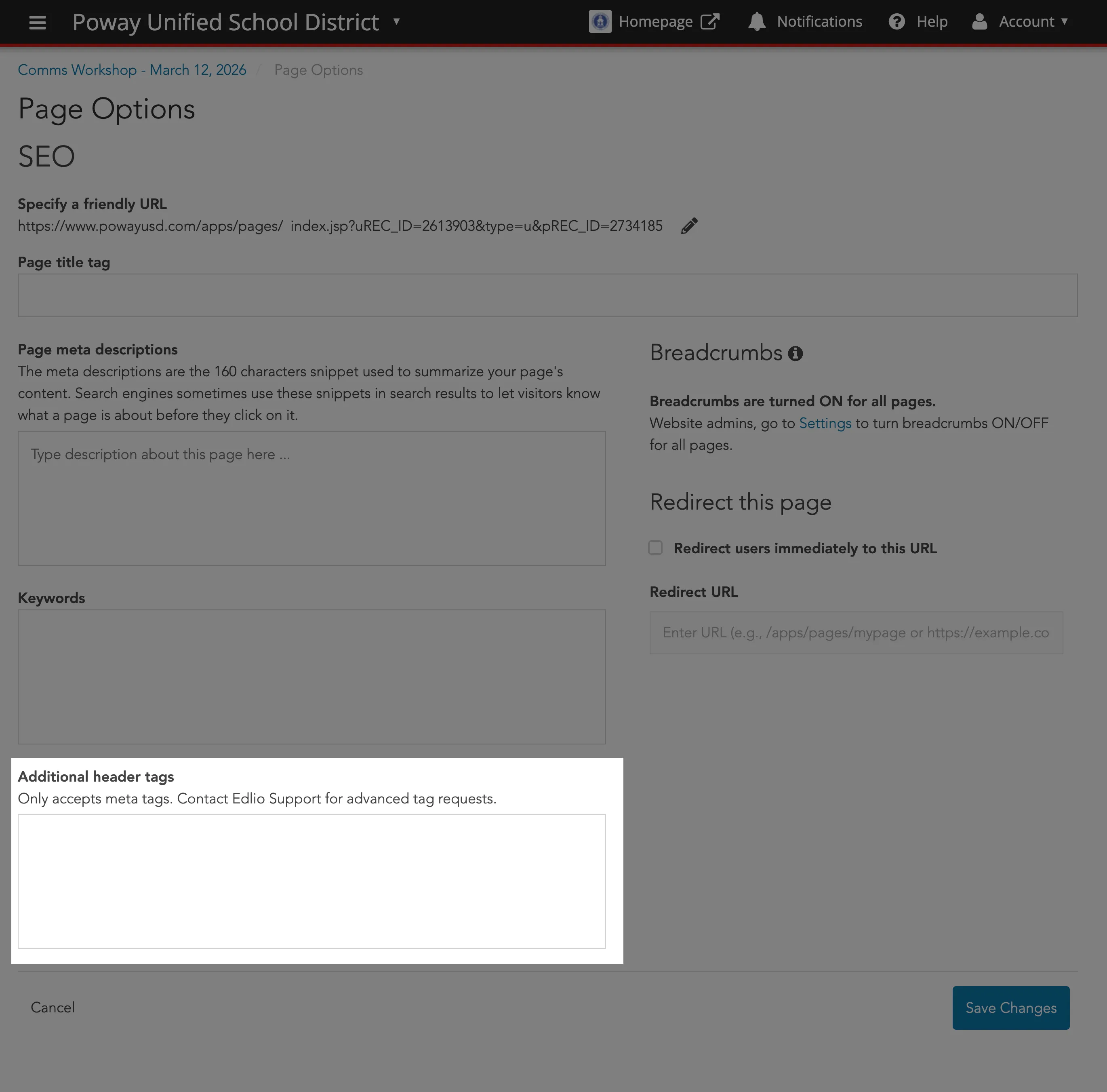
Section titled “Page Options”Access all SEO settings by selecting Page Options from the Actions dropdown menu on any specific page.
Create an easy to remember and more search-engine friendly link.
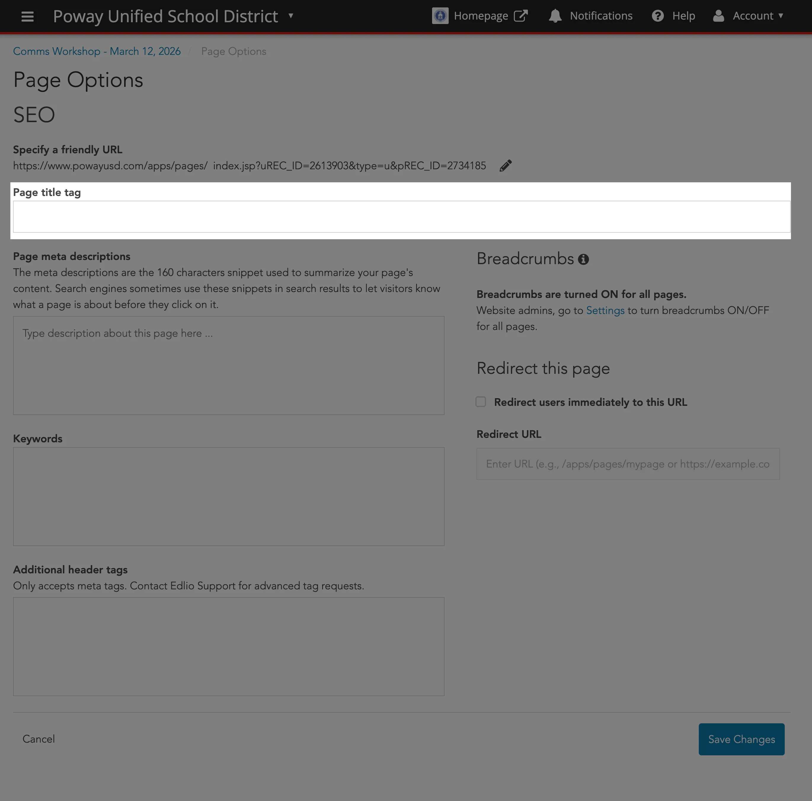
Create a unique, concise title for every page. This appears in the browser tab and is a primary factor in search result rankings.
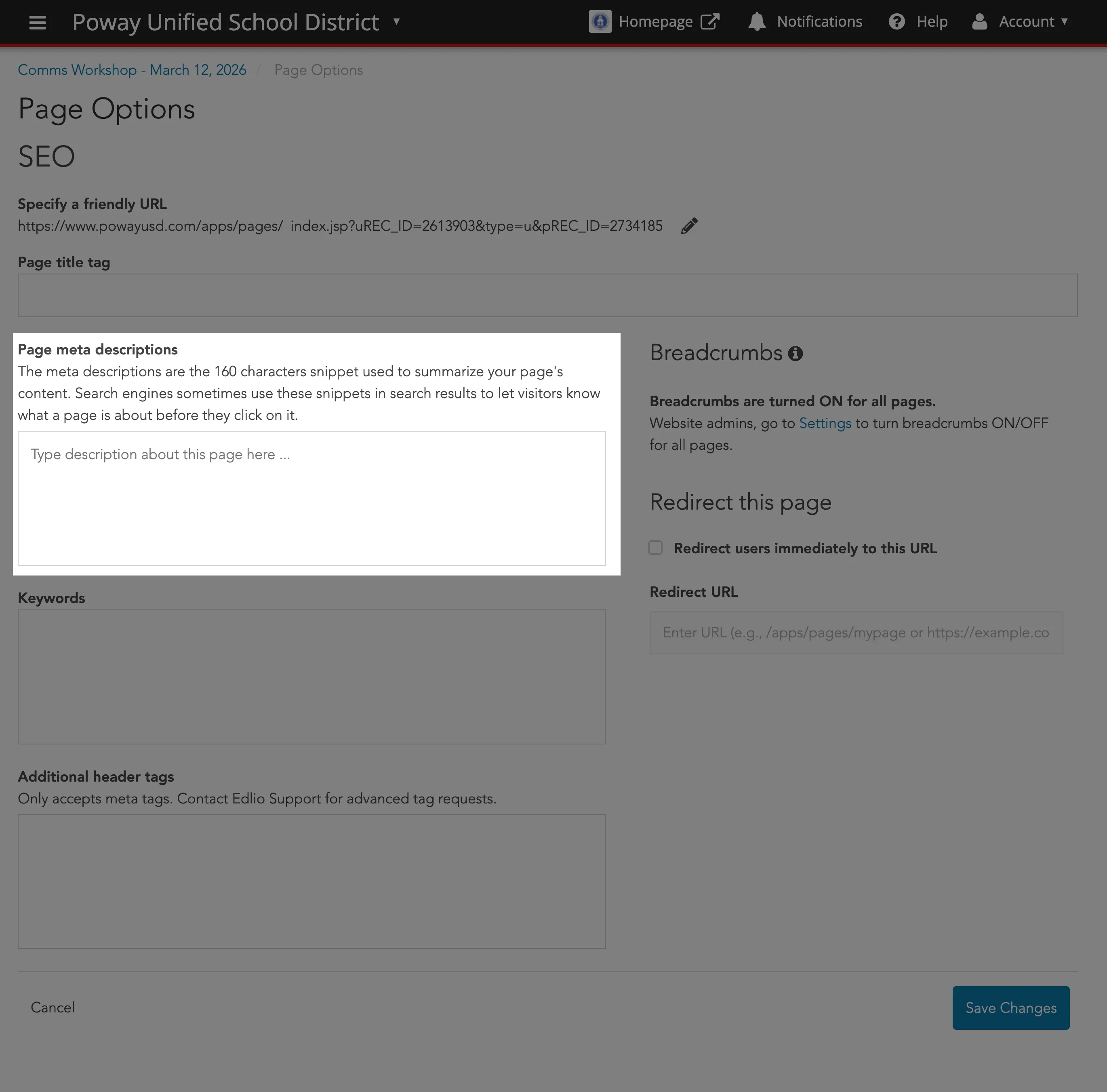
Write a brief summary (under 160 characters) explaining what the page is about.
While less critical than they used to be, you can still add a few relevant terms separated by commas to help search engines categorize your content.
Use these tags to control how your page looks when shared on social media. They ensure the correct image, title, and summary appear in Facebook or Twitter posts.
Breadcrumbs
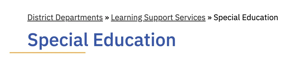
Section titled “Breadcrumbs”Breadcrumbs are secondary navigation elements that shows the user’s current location in a website hierarchy.
In the case of PUSD, most breadcrumbs should start from District Departments then proceed to the actual department (e.g., Learning Support Services) and then the subsequent division, program or specialized service of that department (e.g., Special Education).
And yes, the breadcrumb could certainly go beyond three levels.
Layouts
Section titled “Layouts”Clicking Layout at the top-right of the page allows you to add a side panel and/or hero section if more elements are needed.
For Public Viewers
Section titled “For Public Viewers”These layouts are recommended for public-facing web pages. Right aligned is intended to infer a page is for the general public.
General Use Cases:
- Departments
- Staff pages, Directories
- Resources/Curriculum pages
- Event sections

General Use Cases:
- Articles, blog posts
- Announcements
- About Us/Mission Statement
- Emergency updates

For Internal/EO Viewers
Section titled “For Internal/EO Viewers”These layouts are recommended for Internal/Employee Only resource web pages. Left aligned is intended to infer a page is for an internal audience only.
General Use Cases:
- Departments
- Staff pages, Directories
- Resources/Curriculum pages
- Event sections

General Use Cases:
- Articles, blog posts
- Announcements
- About Us/Mission Statement
- Emergency updates
The Role of Hero Elements
Section titled “The Role of Hero Elements”
Hero elements shape first impressions and influence how users interpret and engage with a layout. Thoughtful placement and clear intent ensure they support—not compete with—content and functionality.
General Use Cases:
- Make a bold/dramatic statement
- Emotional Impact
- Home page, Landing page
- Simple, Direct Calls-To-Action
- Announcements
Additional Layouts
Section titled “Additional Layouts”This layout divides your page into two equal columns. It is the best choice when you have two pieces of information that carry the same importance.
- Best for: Comparing two different school programs, showcasing “side-by-side” features, or balancing a large image with a block of text.
- Visual Impact: It creates a sense of symmetry and balance on the screen.

This layout splits the page into three equal sections across the width of the screen. It is specifically designed for “grid-style” content.
- Best for: Listing multiple services, displaying three distinct highlights of a school event, or organizing brief snippets of information that benefit from a structured grid.
- Visual Impact: It allows you to fit more variety onto a single horizontal line, preventing the reader from having to scroll as much.

Further Reading
Section titled “Further Reading”- SEO for Pages - Learn to boost search rankings by customizing meta descriptions, friendly URLs, and page title tags through the Page Options menu.
- Page Layout - Discover how to structure your site using drag-and-drop content blocks, adjustable Side Panels, and modern Hero Layouts.